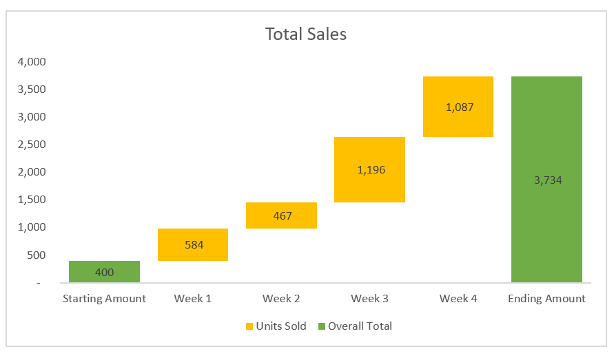
We often use a waterfall chart (or bridge chart) to illustrate how an initial value (like a profit) is affected by a series of positive or negative values over time.
A regular waterfall chart has three main elements:
- the starting amount (this is the first bar in the chart)
- the ending amount or the overall total (this is the last bar in the chart)
- the accumulated amount per period (the floating bars in the chart)
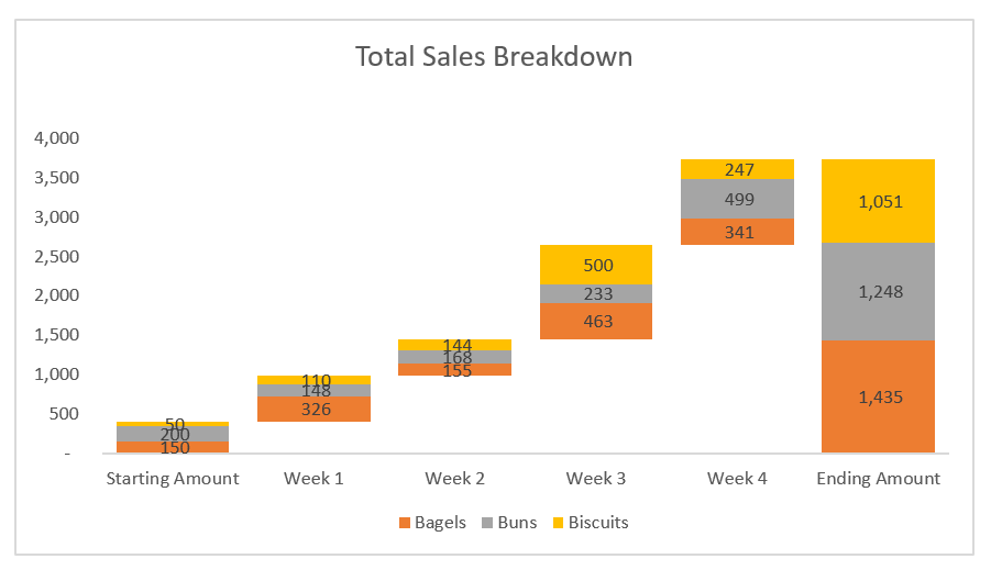
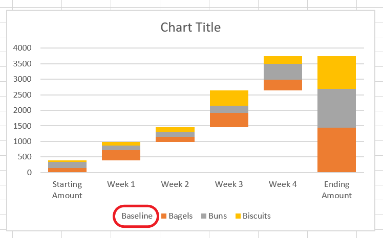
A stacked waterfall chart has one additional element: the breakdown of the accumulated amount per period. This type of chart is great for analyzing what has contributed to the accumulated amount.
In this article, I’ll show you how you can easily create one in Excel.
How to Create a Stacked Waterfall Chart?
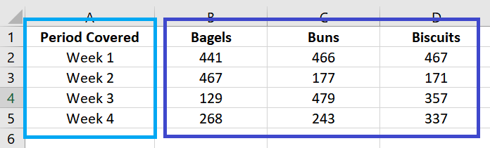
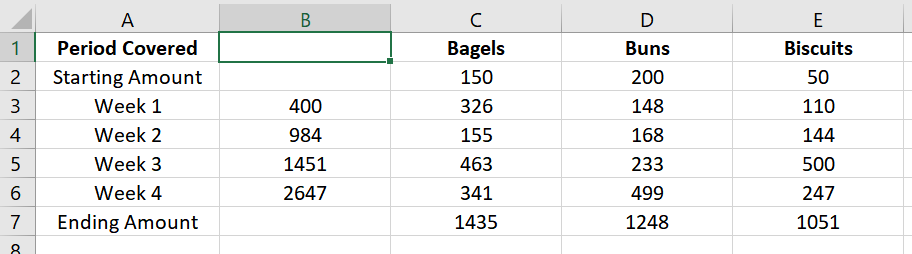
STEP 1: Prepare the dataset.
Your dataset should start with these two columns:
- the period covered (or any variable that you want to use to group the value fields)
- the value fields which contain all the numbers. You can add as many as you like. Each of them will represent one bar stacked on top of the other.
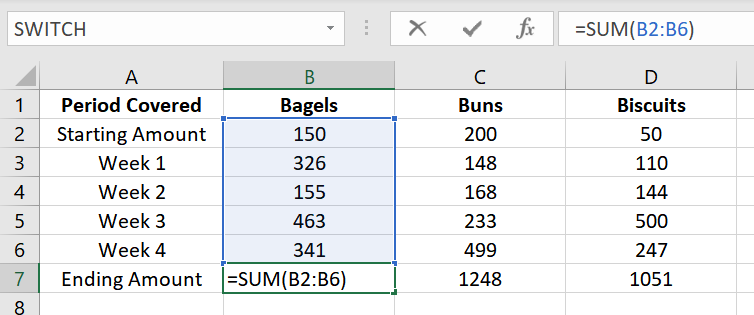
There must be a row for the starting amount and another for the ending amount.
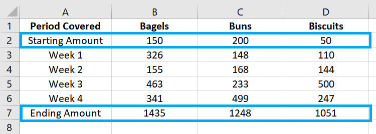
- The starting amount must be after the header, while the ending amount must be after the last row in the dataset.
- Specify the starting amount for each value field. For the ending amount, add a formula to get the total of each value field from the starting amount up to the last data row.
Next, we must insert a new column to our dataset, which we will later use to have the value fields “float” in our chart.
After “Period Covered”, insert a new column. We’ll name this column “Baseline”.
For this new column, we will leave the starting amount and ending amount rows blank since we’re not going to have them float in the chart.
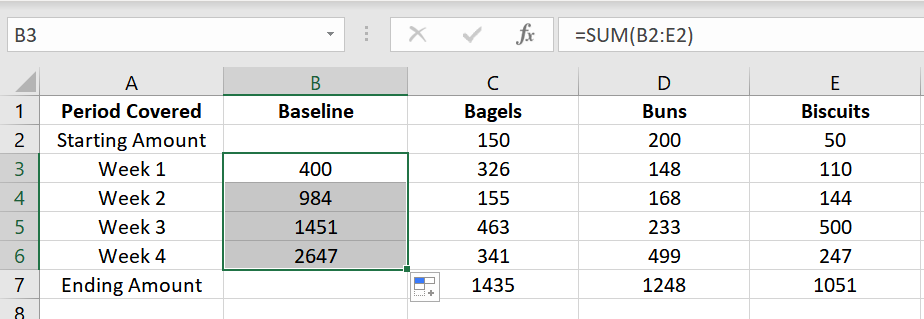
On the second data row, add a formula to get the sum of the [baseline in the previous row] and the [value fields in the previous row].
Example: =SUM(B2:E2)
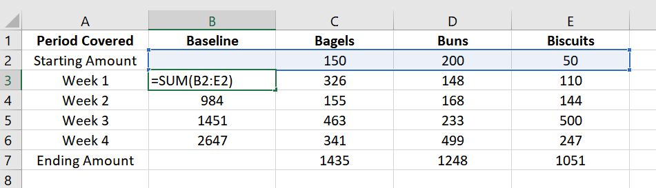
Essentially, we want to get the total of the previous row.
Copy this formula to the remaining rows (up to the last row before the ending amount).
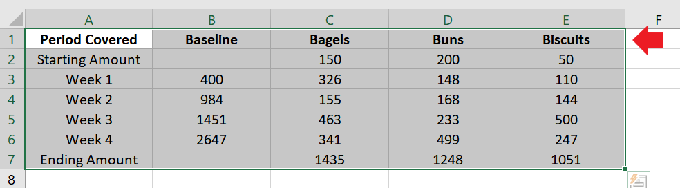
And that’s it! Your dataset is now ready. It’s time to add the chart.
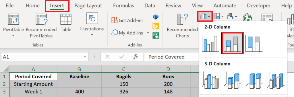
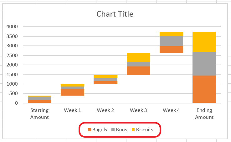
STEP 2: Insert the Stacked Column Chart.
Highlight all the cells in the dataset.
Go to the Insert tab and click the Insert Column or Bar Chart button.
From the list of 2-D Columns, select the Stacked Column chart (second from the list).
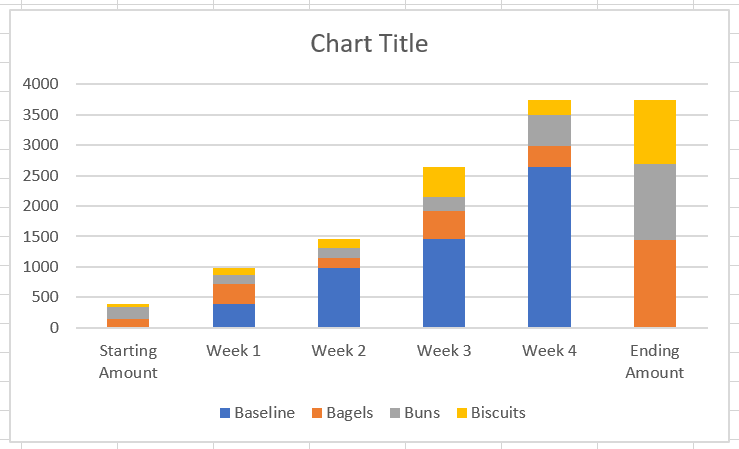
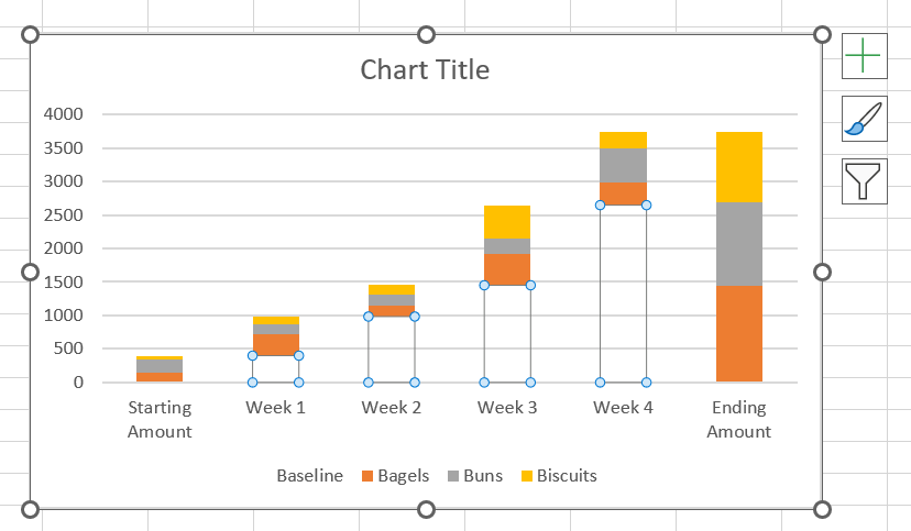
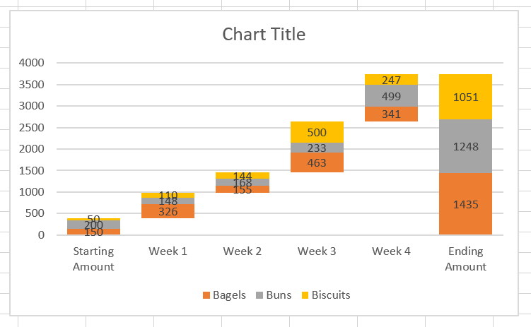
Your chart should look something like this:
STEP 3: Format the Stacked Column Chart to Transform It into a Stacked Waterfall Chart.
Select the Baseline series in your chart.
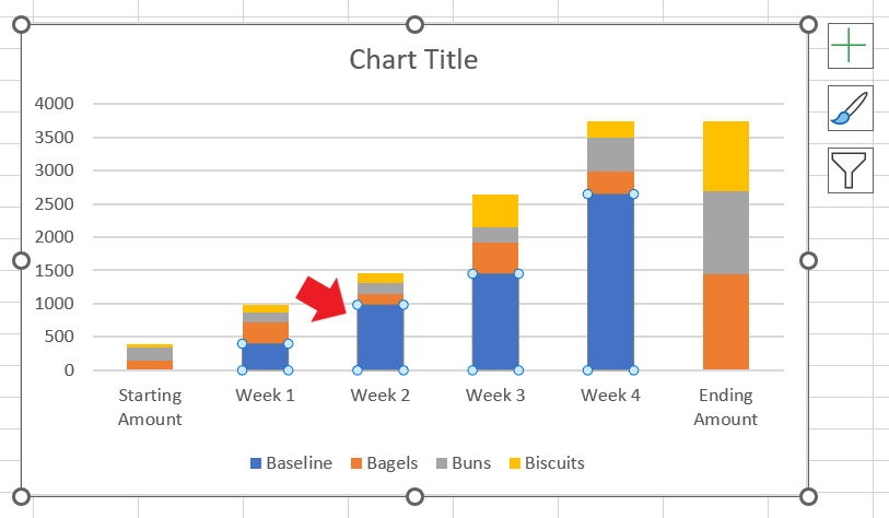
Right-click on it and select Format Data Series.
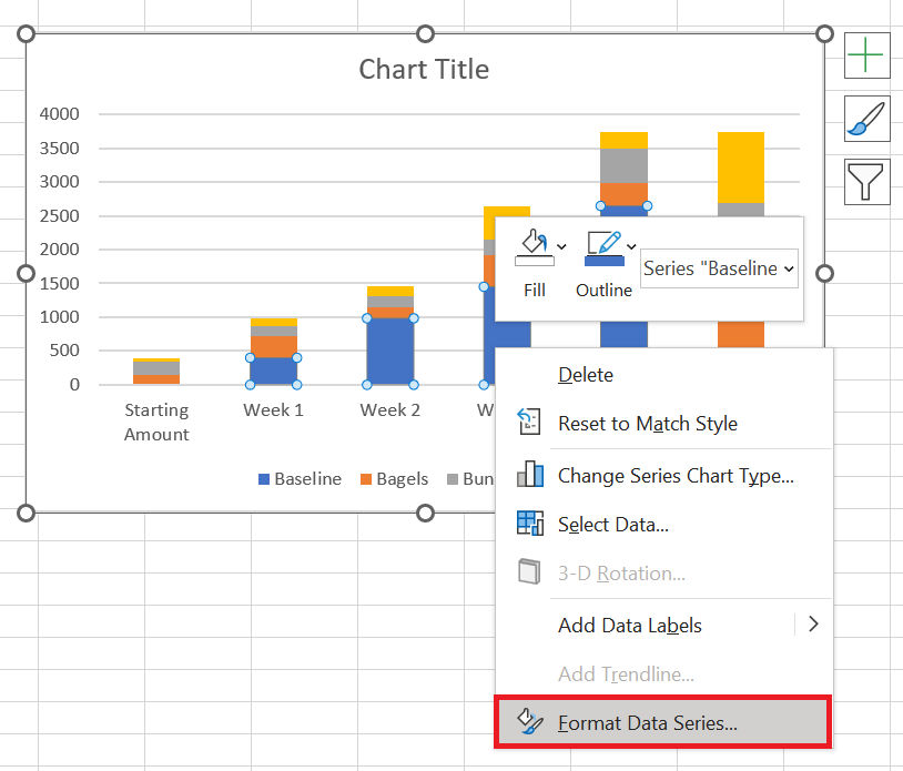
The Format Data Series menu will appear on the right side of the screen.
Click the paint bucket button. Go to the Fill section and select “No fill”.
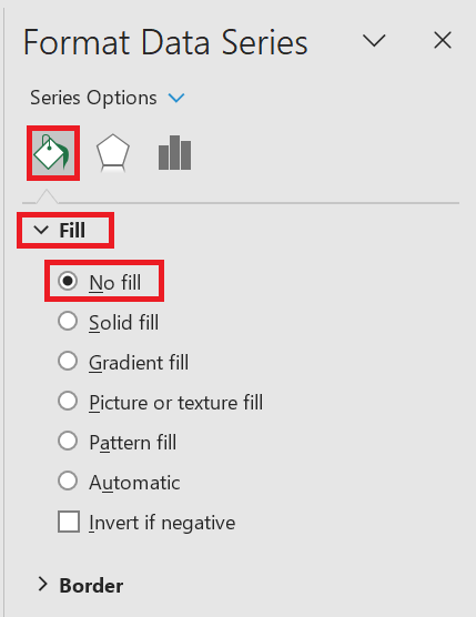
Your chart should now start looking like a waterfall chart as the value fields now appear to float.
Next, we’ll adjust the gap width so that the columns are closer to each other.
With the baseline series still selected, go back to the Format Data Series menu.
Click the button that looks like a set of bars. Go to the Series Options section and change the Gap Width to 40% (or any number you prefer).
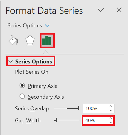
The bars in your chart should now be closer to each other.
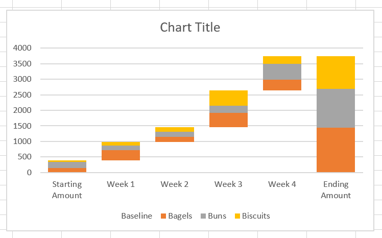
Next, we’ll hide the word “Baseline” from the list of legends (since it’s now non-existent).
Go to the dataset and delete the Baseline header.
It should now disappear from the list of legends.
Now, let’s add data labels to the series so you can see the numbers in the chart.
Right-click one of the data series and select Add Data Labels.
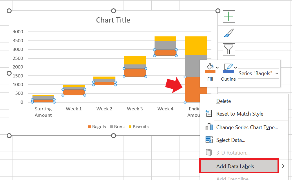
Repeat this step on all the visible data series.
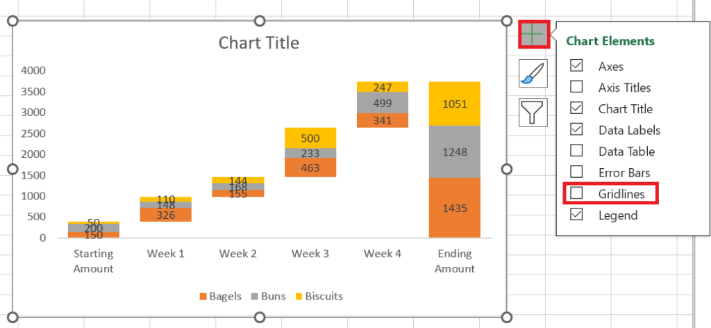
For the final touch-ups, let’s remove the gridlines and the y-axis.
Click anywhere on the chart and click the plus (+) sign that appears next to it.
From the list of Chart Elements, uncheck the Gridlines checkbox.
Next, hover your mouse over the Axes checkbox. You’ll see a right arrow (>) appear next to it.
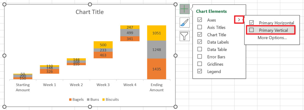
Click on that arrow and uncheck the Primary Vertical checkbox.
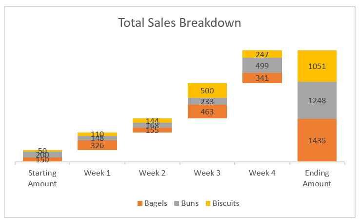
For the final step, rename the chart title with the appropriate name.
And that’s it! You now have a stacked waterfall chart in your sheet.
Conclusion
Stacked waterfall charts are great for analyzing the trend in your data and how each number contributed to the overall total. I hope this article has helped you easily create one in Excel.