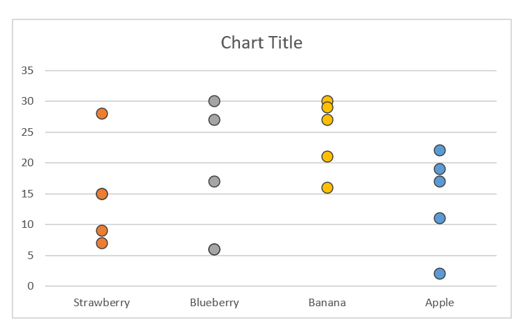
How to Make a Scatter Plot in Excel (2024)

Do you have columns of quantitative data in your Excel sheet that only consist of a list of figures? How can you visualize and analyze the relationship between this quantitative data at a glance? Through a scatter plot.

Scatter plots are the best when it comes to comparison between two sets of quantitative data. The article that follows will help you learn all about scatter plots in Excel.

What is a Scatter Plot?

A scatter plot is a two-dimensional graph that pictures the relationship between two variables.

It has two axes; the horizontal axis is known as the X-axis, whereas the vertical axis is known as the Y-axis. For the reason of having these two axes, it is also known as the XY graph.

One of the variables (mostly the independent variable) is plotted against the X-axis and the other variable (mostly the dependent variable) is plotted against the Y-axis.

After the data points are plotted, the relationship between both the variables is depicted through the intersection points of the x and y-axis.

Before we move forward, here’s a sneak peek into what a scatter plot looks like.

A scatter plot in Excel

When to Use a Scatter Plot in Excel?

Scatter plots are designed to visualize the relationship between two variables. It is best used to show how strongly two variables are related or correlated to each other.

Visually, the closer the data points lie to each other on a scatter plot, the stronger the relationship between them.

A scatter plot will be of great use when two variables are to be compared and the relationship between them is to be studied.

For a quick example, if you want to study the relationship between the price and demand of a product, you may plot a scatter plot with data points for both variables.

This will let you visualize how the demand for a product (the dependent variable) fluctuates in the market as the price of the product (the independent variable) is increased or decreased.

A scatter plot created to visualize the relationship between the price and demand of a product

The above image shows the relationship between five data points for both the variables, price, and demand. As the price increases from $100 to $150, the demand for the product falls from 70 units to 60 units. This shows that there exists a negative correlation between both variables.

Scatter plots can be used for many other similar comparisons where quick visual analysis of the data is sought.

How to Create a Scatter Plot in Excel?

Surprising to know, but scatter plots are one of the easiest graphs of Excel in terms of creation. Creating a scatter plot in Excel is all about two steps, both of which are explained hereunder through an example.

Data for promotional expense and related sales of a Company

The above data represents the promotional expense of a Company along with the resultant sales won by the Company over 5 months. How can this be plotted in a scatter diagram?

Step 1:

Scatter plot creation in Excel begins with organized source data. It is pertinent to note that scatter plots are designed for two-dimensional data sets, only.

As the first step, select the two columns of your quantitative data set i.e. the column for promotional expense and sales.

Selection of the two columns from the quantitative data sets

Step 2:

With both the columns selected, follow the path below to insert a scatter plot.

Insert Tab > Charts > Scatter Plot > Scatter with Smooth Lines and Markers

This inserts a scatter plot to your Excel, as shown below.

Alt-text: Excel converts the source data into a scatter plot

In the image above, Excel has converted the underlying dataset for promotional expense and sales into a scatter plot. The plot shows a right-upward trend line that demonstrates a direct relationship between both variables.

As the independent variable on X-axis (the promotional expense) continues to increase, the sales must also increase.

Must know!

You can replace the scatter plot type ‘Scatter with Smooth Lines and Markers’ selected above with any other type of scatter chart by selecting a different type of scatter chart. Excel offers 5 different types of scatter charts that are discussed in detail below!

Pro-tip:

It is advisable to plot the independent variable on the X-axis and the dependent variable on the Y-axis for a better analysis of the relationship between them both.

For excel to plot so, the independent variable should be placed as the first column in the data set, and the dependent variable should come next. The example above demonstrates a similar positioning of the numerical columns in the source data.

Types of Scatter Plot

In addition to the smooth line scatter plot in the example above, Excel has 4 other types of scatters plot to offer.

Even with different scatter plot types, the purpose for each type of scatter plot remains the same i.e. to visualize the relationship between two variables. However, you may choose different scatter plot types for different presentation styles.

The 5 types of scatter plots offered by Excel are listed below.

        i.          Scatter

The first and the most basic type of scatter plot is a simple scatter plot with markers and no lines. This plot only adds markers (dots) to each intersection point of both variables.

Scatter’ type of scatter plot in Excel

      ii.            Scatter with smooth lines and markers

This type of scatter chart adds a smooth line (also a slightly curved line) that traces the markers placed at each intersection point of both the variables.

Alt-text: ‘Scatter with smooth lines and markers’ type of scatter plot in Excel

    iii.            Scatter with smooth lines

Similar to ‘Scatter with smooth lines and markers’, this scatter plot type removes the markers from the plot, and only a smooth line draws the relationship between both the variables.

Scatter with smooth lines’ type of scatter plot in Excel

    iv.            Scatter with straight lines and markers

This type of scatter plot is very similar to the scatter plot with smooth lines and markers, with the only exception that the relationship line in this plot is not smooth or curved but straight and sharp.

Scatter with straight lines and markers’ type of scatter plot in Excel

      v.            Scatter with straight lines

Under this type of scatter plot type, the straight line of the relationship between both the variables is not accompanied by markers at the intersection points of both the variables.

Scatter with straight lines’ type of scatter plot in Excel

Pro Tip:

When deciding about the type of scatter plot that best suits your data set, do not waste time inserting and deleting each different scatter plot type.

Instead, select the data and launch the ‘See all charts’ option by clicking on the small arrow to the right of the Chats section on the Insert tab.

Launching the ‘See all charts’ in Excel

This would open up the chart menu bar. From the chart types in the left pane, select XY (scatter).

Consequently, from all 5 different scatter chart types that appear on the top, click on different types to preview how the chart would look like when plotted.

Previewing different scatter plot types under one window

Adding a Trendline

After we have learned to construct a scatter plot in Excel, it’s time we learn how a trendline can be added to a scatter plot.

A trendline is added to scatter plots to enhance the visualization and analysis of the relationship between the two variables. It connects a series of data points and is also known as the ‘Line of best fist’.

Here’s how you can add it to a scatter plot in Excel.

A simple scatter plot in Excel

To add a trendline to the scatter plot above, right-click on any of the markers (the blue little crosses) on the plot. This should open the drop-down menu as shown below. Select the option ‘Add trendline’ from the dropdown menu.

Selecting ‘Add a trendline’ from the drop-down menu

This adds a dotted blue trendline to your scatter plot.

Excel adds a trendline to the scatter plot.

This also opens up the ‘Format Trendline’ window on the right, from where you can choose different formatting options for the trend line.

Under these options, you can customize how the line looks through the color, thickness, and transparency of the line.

You may also add a 3D effect to it through shadows, glow effects, and much more.

Trendline formatting options

Visualization Options

Excel offers 5 different visualization options for scatter plots. These range from Classic Scatter plots to scatter plots with smooth to straight lines with or without markers.

In addition to these, there are further different presentation styles for each chart type.

For example, you may remove the gridlines from your chart, if desired. From the ‘Chart Elements’ button, uncheck the option ‘Gridlines’ to have a blank background for your chart.

Gridlines removed from the scatter plot

Similarly, click anywhere on the chart to launch the ‘Design’ tab in the Ribbon and go to:

Design Tab > Chart Layouts > Quick Layouts

Excel offers 11 different layout options for scatter plots. Here’s how Layout 10 looks when applied to the scatter plot created in the example above.

Layout 10 from Quick Layouts applied to the scatter plot

Customization Options

It’s not over after you have plotted a scatter diagram in Excel. In fact, Excel offers a number of options to users for customizing the scatter plot once created. Some of these customization options are discussed below.

1.      Chart Labels

A chart without labels? Even sounds boring.

Once you have constructed a scatter plot, adding chart labels to it is only a matter of a few keystrokes.

  1. Select the scatter plot by clicking anywhere on it to launch the three icons on the right of the plot.

The Chart Elements Option

  1. Click on the Chart Elements button as shown above. From the list of Chart elements that open up, check the box for ‘Chart Title’. This would bring a small text box to the top of your chart. Click on it to edit it and add the chart title as desired.
  2. Clicking on the text box for ‘Chart Title’ launches the ‘Format Chart Title’ pane on the right of the worksheet, where you can edit the Chart Title in several ways.
The ‘Format Chart Title’ Pane

In addition to Chart Title, you may also want to add labels to both the axes.

  1. To do so, go to the ‘Chart Elements’ button and from the list of ‘Chart elements’ that opens up, check the box for ‘Axes Titles’. This would bring two small text boxes parallel to each of the axes. Click on each box to edit it and add the axis title as desired.
Axes Titles added to the scatter plot

  1. To launch the ‘Format Axes Titles’ pane, you may launch ‘More options’ by clicking on the small arrow that appears to the right of ‘Axes Titles’ in the Chart Elements drop-down menu.
The ‘Format Axes Titles’ Pane

2.      Data Labels

With a few data points, it is often feasible to label the data points for a more appealing presentation of the relationship between both variables.

Here is how you can add data labels to your scatter plot.

  1. Select the scatter plot by clicking anywhere on it. Upon being selected, click on the Chart Elements button (the plus icon) as shown below.
The Chart Elements Option

  1. From the list of ‘Chart elements’ that opens up, check the box for ‘Data Labels’ and click on the small arrow that appears to the right for more options.
  2. This would take you to the Format Data Labels pane, wherefrom you can select the labels along with other formatting positions.
The Format ‘Data Labels’ Pane

  1. For instance, we want each intersection point in the scatter plot of our example above to be labeled by the month name. We have selected the option ‘value from cells’ and with the cell range containing the month names (A2:A6 in our example) defined.
Data Labels added to the scatter plot

3.      Chart Design

Who says charts are only supposed to be like old monochrome pictures? In Excel, you can customize your scatter plot to different designs and colors.

Simply select the chart and go to the ‘Design’ tab on the Ribbon.

Design’ tab on the Ribbon.

This offers a wide variety of chart designing options to Excel users, where you change the overall chart style, chart colors, chart layout, and much more.

For instance, here’s what the scatter plot looks like after we’ve applied the dark chart style to it.

Chart style changed from simple to dark

Bottom Line:

Creating a simple scatter plot in Excel is super easy and practicing the above-explained steps, and pro tips can help you master the creation of scatter plots in Excel in a relatively shorter time. Keep practicing!

How to Create a Stem and Leaf Plot in Excel?

Before anything, what is a stem and leaf plot? You are likely to not have heard of it before. However, the general idea that first hits your mind upon hearing of a stem and leaf plot is a plot that might have many leaves rooting from a stem.

That’s exactly how a stem and leaf plot is. Under a stem and leaf plot, we break each number of a given data set into a stem and leaf.

To keep you short on surprise, here is how the idea of a stem and leaf plot looks in action.

A general stem and leaf plot

Clearly visible above, the first digit of every number serves as the stem and the last digit makes it up like a leaf.

A stem and leaf plot visualizes the distribution of numbers within a range. These plots are helpful as they allow users to perform a quick analysis of the distribution of data across different categories.

Not only does it help you with easy scanning of data, but also with the calculation of mean, median, mode, and other statistical basics.

Creating a Stem and Leaf Chart in Excel

We have seen Excel put together bar charts, line charts, pie charts, scatterplots and so many more. But when it comes to a stem and leaf plot, Excel doesn’t offer an in-built function for creating a stem and leaf plot.

However, that must not stop you from building a stem and leaf plot in Excel through alternate methods. For now, let us look into the most basic method for creating a stem and leaf plot in Excel.

It is to be noted that this method is manually driven and works best for sets of smaller sizes (under 100s).

Data series ranging between 10 to 40

To create a stem and leaf plot from the above data series, the following steps are to be followed:

Step 1:

First of all, the data must be arranged in ascending order for ease of plotting. To do so, select the data and go to:

Home Tab > Editing > Sort & Filter > Smallest to Largest
The Sort function of Excel

Excel will arrange the data in ascending order as shown below.

Excel sorts the data in an ascending order

Step 2:

Determine the minimum and maximum values of your data set to plot the stems. This can be done through the Minimum and Maximum functions as shown below.

Determining the minimum and maximum values of the data set

Step 3:

With 10 and 38 as the minimum and maximum values, we know the data lies between 10s to 30s. The stems, therefore, range from 1 to 3 (the first digit of 10, 20, and 30).

Plot the said range in a column as shown below.

Alt-text: Plotting the stems in Excel
Pro Tip: 

For better presentation, you may align the stems to the right and add a right side border to them. Unchecking the ‘Show Gridlines’ mode from View Tab > Show > Gridlines can add to the visual appeal of the plot.

Step 4:

The next step is to plot the leaves across the plot. There are two ways how this can be done.

  • Manually, by tally-marking each number from the data and adding a leaf for each number against the relevant stem.
  • Using the COUNTIF formula nested in the REPT Function which might get complex and super lengthy.

We have plotted the leaves in the plot manually by plotting the last number of each digit in a cell against the relevant stem (first digit of that number). The plotted chart should look like the following.

Plotting the leaves in Excel

And that’s it! Your stem and leaf plot is all done.

Pro Tip:

As this plot is only manually made, it is prone to human error.­­­­ A quick way to check your stem and leaf plot for accuracy is to count the number of leaves. As our dataset consists of 14 numbers in total, there should be 14 leaves on the plot.

Bottom Line

We hope you enjoyed making a stem and leaf plot in Excel.

Must note that there can be many variations to the steps involved above and how the final plot looks like.

The methods discussed above are the most basic ones that will help you plot a small data set.

However, as the data grows in size, you might need to move to other methods.

How to Move a Chart to a New Sheet in Excel? (Also VBA Code)

Charts are a great way to visualize data. Since we’re dealing with visualizations, the placement of these charts also matters. Oftentimes, it’s better to separate the raw data from the charts to make our dashboards clean and more appealing. In this article, I’ll show you ways to do just that.

Move the Chart to a New Sheet as a Chart Object

To move the chart to a new sheet as a chart object:

Click on a blank space on your chart to select it.

1. Click on a blank space on your chart to select it.

2. Once the entire chart is selected, click Chart Design from the Excel ribbon.

Go to the 'Chart Design' tab from the Excel ribbon and click 'Move Chart'.

Go to the Location section and click Move Chart.

3. The Move Chart menu will appear.

Steps to move chart as an object to a new sheet.

Tick the Object in option.

From the dropdown menu, select the sheet where you want to move the chart and click OK.

NOTE: If you haven’t yet added that sheet, close the menu first, insert a new sheet, and redo the steps.

4. Once you click OK, you will be redirected to the specified sheet.

Sample output after moving chart as an object to a new sheet.

You’ll then see the chart that you have previously selected.

Drag the chart to wherever you like to position it inside that sheet. And that’s it! You’re all set.

Move the Chart to a Chart Sheet

If you prefer a designated sheet for your chart, then it would be best to move the chart to a Chart Sheet.

Example of a chart in a chart sheet.

A chart sheet is like a regular worksheet, except that a chart sheet has no gridlines, making it easy to read through the chart.

The chart inside it is also magnified and centered. Anyone can easily go over it.

The chart cannot be resized by the users. It cannot even be deleted. If you want to delete the chart, you must delete the sheet itself because it is directly linked to it.

Setting up a chart sheet is perfect if you want your target audience to be able to focus on the chart and examine it without any distractions.

To move your chart to a chart sheet:

1. Right-click on the chart. When the pop-up menu appears, select Move Chart.

Right-click on chart and select 'Move Chart' from the menu that pops up.

2. The Move Chart menu will appear.

Steps to move chart to a chart sheet.

From the list of options, select New Sheet.

Enter the name you want for this chart sheet and click OK.

3. And that’s it! You now have your chart added to a chart sheet.

Sample output after moving chart to a chart sheet.

Move the Chart to a New Sheet Using the Cut and Paste Method

If you prefer doing things with keyboard shortcuts, then you will like this method.

To transfer a chart from one sheet to another, simply select the chart and press CTRL + X to cut it.

Click the chart and press CTRL + X to cut it.

Once it’s cut, go to the sheet where you’d like to transfer it.

Click on the cell where you’d like to position your chart. Once selected, press CTRL + V to paste.

Steps to paste the chart that was cut.

And that’s it! You have successfully transferred the chart onto the new sheet.

Sample output after applying the cut and paste method.

Move Multiple Charts to a New Sheet in One Go Using VBA

If you have multiple charts spread throughout different sheets in your workbook and you want to place them all in just one sheet, then this method is perfect for you.

This approach is great for creating a dashboard because you can transfer all sheets in one go. No need to go through each sheet to transfer each of them. 

To do this:

1. While your workbook is open, press ALT + F11 to open the VBA Editor.

2. Then, from the Insert menu, select Module.

Steps to insert a new module.

3. Copy the following code and paste it onto the new module added. 

Option Explicit

Sub MoveAllChartsToOneSheet()
'moves all charts inside the workbook in one worksheet

    Dim chrtObj As Object, ws As Worksheet, sheetName As String, chartWS As Worksheet
    
    sheetName = "All Charts"   'note: change the text inside the double quotes to change the name of the worksheet where all charts will be moved to.
    
    On Error Resume Next
    Set chartWS = ThisWorkbook.Worksheets(sheetName)
    
    If Err.Number > 0 Then
        ThisWorkbook.Worksheets.Add
        ThisWorkbook.ActiveSheet.Name = sheetName
    End If
    
    On Error GoTo 0
    Set chartWS = ThisWorkbook.Worksheets(sheetName)
    
    For Each ws In ThisWorkbook.Worksheets
        If ws.Name <> sheetName Then
            For Each chrtObj In ws.ChartObjects
                chrtObj.Chart.Location xlLocationAsObject, sheetName
            Next
        End If
    Next
    
End Sub
Copy code to the new module added.

This macro will automatically create a new sheet named “All Charts” and place all the charts inside it.

If you want to use a different name for the worksheet (e.g., Dashboard), edit the code and change the text assigned to sheetName.

The worksheet name is highlighted in the code.

Remember to enclose the name in double quotes (“”).

4. Now, it’s time to run the code.

IMPORTANT:

Note that once you run the code, the changes cannot be undone. As a precaution, you can create a copy of the workbook first before running the code so that you’ll have a backup copy.

To run the macro, click anywhere inside the code. You should see the text cursor blinking inside the macro.

Click anywhere on the code before running it.

Next, press F5 to run it.

After a few seconds, close the VBA Editor and go back to your workbook.

5. You should now see all the charts on top of each other in the “All Charts” worksheet (if you have not renamed it).

Sample output after running the macro.

6. Click on each chart and drag them across the sheet to position them wherever you want them to be.

Sample output after moving the charts and resizing them to have them fit in the worksheet.

7. Also, as a pro tip, you might want to remove the gridlines from the worksheet to make it look clean, making the charts easier to read.

To do this, click the View tab from the Excel ribbon and uncheck the Gridlines checkbox under the Show section.

Steps to hide gridlines in worksheet.

That’s it! All the gridlines should now disappear from your sheet.

Sample output after removing the gridlines.

8. When you close or save the file, you might encounter the following prompt:

The prompt that appears when you try to save a .xlsx file with the macro added.

If you no longer need to run the code next time, click Yes to continue. Doing so will remove the macro from your file.

On the other hand, if you want to save the file with the code, click No and select .xlsm or .xlsb as the file format.

Conclusion

Excel charts are perfect for summarizing long rows of data. They give our targeted audience a glimpse of “what’s happening” through these graphical representations.

Organizing these charts and placing them on specific sheets can significantly increase the professional appeal of your workbook. I hope the suggested methods above help you do so with ease.

How to Create a Stacked Waterfall Chart in Excel?

We often use a waterfall chart (or bridge chart) to illustrate how an initial value (like a profit) is affected by a series of positive or negative values over time.

A regular waterfall chart has three main elements:

  • the starting amount (this is the first bar in the chart)
  • the ending amount or the overall total (this is the last bar in the chart)
  • the accumulated amount per period (the floating bars in the chart)
Example of a regular waterfall chart

A stacked waterfall chart has one additional element: the breakdown of the accumulated amount per period. This type of chart is great for analyzing what has contributed to the accumulated amount.

Example of a stacked waterfall chart

In this article, I’ll show you how you can easily create one in Excel.

How to Create a Stacked Waterfall Chart?

STEP 1: Prepare the dataset.

Your dataset should start with these two columns:

  1. the period covered (or any variable that you want to use to group the value fields)
  2. the value fields which contain all the numbers. You can add as many as you like. Each of them will represent one bar stacked on top of the other.
Example of a dataset containing the 2 required elements for a waterfall chart.

There must be a row for the starting amount and another for the ending amount.

Example of dataset with rows for starting amount and ending amount.

  • The starting amount must be after the header, while the ending amount must be after the last row in the dataset.
  • Specify the starting amount for each value field. For the ending amount, add a formula to get the total of each value field from the starting amount up to the last data row.
Add a formula to the ending amount row to get the total from the starting amount row up to the last data row.

Next, we must insert a new column to our dataset, which we will later use to have the value fields “float” in our chart.

After “Period Covered”, insert a new column. We’ll name this column “Baseline”.

For this new column, we will leave the starting amount and ending amount rows blank since we’re not going to have them float in the chart.

Add the formula to all rows of the Baseline column except for the starting amount and ending amount rows.

On the second data row, add a formula to get the sum of the [baseline in the previous row] and the [value fields in the previous row].

Example: =SUM(B2:E2)

The baseline formula should get the total of the previous rows.

Essentially, we want to get the total of the previous row.

Copy this formula to the remaining rows (up to the last row before the ending amount).

And that’s it! Your dataset is now ready. It’s time to add the chart.

STEP 2: Insert the Stacked Column Chart.

Highlight all the cells in the dataset.

Highlight all the cells in the dataset.

Go to the Insert tab and click the Insert Column or Bar Chart button.

From the list of 2-D Columns, select the Stacked Column chart (second from the list).

Steps to insert a stacked column chart.

Your chart should look something like this:

Sample output after inserting a stacked column chart.

STEP 3: Format the Stacked Column Chart to Transform It into a Stacked Waterfall Chart.

Select the Baseline series in your chart.

Select the "Baseline" series in the chart.

Right-click on it and select Format Data Series.

Right-click on the selected series and select "Format Data Series".

The Format Data Series menu will appear on the right side of the screen.

Click the paint bucket button. Go to the Fill section and select “No fill”.

Click the paint bucket button from the Format Data Series menu. Go to the Fill section and select “No fill”.

Your chart should now start looking like a waterfall chart as the value fields now appear to float.

Sample output after setting the Baseline series to "No Fill".

Next, we’ll adjust the gap width so that the columns are closer to each other.

With the baseline series still selected, go back to the Format Data Series menu.

Click the button that looks like a set of bars. Go to the Series Options section and change the Gap Width to 40% (or any number you prefer).

Steps to change the Gap Width of the chart series.

The bars in your chart should now be closer to each other.

Sample output after changing the gap width of the chart series.

Next, we’ll hide the word “Baseline” from the list of legends (since it’s now non-existent).

Baseline is highlighted in the chart legend.

Go to the dataset and delete the Baseline header.

Remove the "Baseline" header from the dataset.

It should now disappear from the list of legends.

"Baseline" is now removed from the chart legend.

Now, let’s add data labels to the series so you can see the numbers in the chart.

Right-click one of the data series and select Add Data Labels.

Right-click on one of the data series in the chart and select "Add Data Labels".

Repeat this step on all the visible data series.

Sample output once all data labels are added to the chart.

For the final touch-ups, let’s remove the gridlines and the y-axis.

Click anywhere on the chart and click the plus (+) sign that appears next to it.

From the list of Chart Elements, uncheck the Gridlines checkbox.  

Steps to hide the gridlines from the chart.

Next, hover your mouse over the Axes checkbox. You’ll see a right arrow (>) appear next to it.

Steps to remove the y-axis from the chart.

Click on that arrow and uncheck the Primary Vertical checkbox.

For the final step, rename the chart title with the appropriate name.

And that’s it! You now have a stacked waterfall chart in your sheet.

Example of a stacked waterfall chart created in Excel.

Conclusion

Stacked waterfall charts are great for analyzing the trend in your data and how each number contributed to the overall total. I hope this article has helped you easily create one in Excel.

How to Create a Forest Plot in Excel?

Also known as the “blobbogram”, a Forest Plot is a graph showing a visual comparison of the scientific or clinical studies conducted on a particular case or study. It is often used in medical and epidemiological fields for the meta-analysis of clinical trial results. What’s great about it is that you can view the outcome of several studies on a particular subject concurrently.

Unfortunately, Forest Plot is not readily available in Excel, so you can’t simply insert one. There is, however, a workaround for this, and I’ll show you how to do just that. 

How to Create a Forest Plot in Excel?

STEP 1: Prepare the dataset.

A forest plot would require the following basic information:

  • Name of the Study
  • Effect Size – refers to the weight of the study. For this field, you can use the Odds Ratio, Hazard Ratio, or Mean Difference.
  • Lower CI – represents the lower 95% Confidence Interval (CI) of every Effect Size.
  • Upper CI – represents the upper 95% CI of every Effect Size.
Sample dataset containing the required fields for a Forest Plot.

Aside from these four fields, we will need to add three more columns to create the forest plot in Excel.

Next to your dataset, add the following column headers:

  1. Position
  2. CI Line Lowest
  3. CI Line Highest
Add these 3 additional headers to your dataset: Position, CI Line Lowest, and CI Line Highest.

Position  

We will use this field to specify where the dot should be on the y-axis. On the first cell, enter the number 0.5.

Next, add a formula to the remaining cells to add 1 to the cell that comes before it (see example below). 

Sample formula to use for the Position column.

CI Line Lowest

To draft the horizontal CI Line in our forest plots, we need to calculate the lowest and highest CI for each Effect Size.

In this column, add the following formula to subtract the Lower CI from the Effect Size (in my case, the Odd Ratio):

=[Effect Size] - [Lower CI]
Sample formula to add to the CL Line Lowest column.

CI Line Highest

In this column, use the following formula to subtract the Effect Size from the Upper CI.

=[Upper CI] - [Effect Size]
Sample formula to add to the CL Line Highest column.

STEP 2: Insert a 2-D Horizontal Bar Chart.

Highlight the first two columns in the dataset (Study and Effect Size).

Highlight the first 2 columns in the dataset.

Go to the Insert Tab. Click the top left button after the Recommend Charts.

Steps to insert a clustered bar.

From the list of 2-D Bar charts, select the Clustered Bar (the first one in the list).

You should now have your horizontal bar chart inserted on your sheet.

Sample horizontal bar chart in Excel.

STEP 3: Move the Vertical Axis Labels to the Left of the Chart.

If you have negative values for the Effect Size, the bars on your chart will likely overlap with the vertical axis labels. It will look something like this: 

Example of what happens when there's a negative value in a horizontal bar chart.

If this is the case, you need to adjust the vertical axis to position it towards the left of the bars.

NOTE: You can skip this step if you only have positive values for your Effect Size.

Right-click on the vertical axis labels and select Format Axis.

Right-click on the vertical axis labels and select "Format Axis".

The Format Axis menu will appear on the right side of the screen.

Find the Labels section and change the Label Position to “Low”.

Steps to change the Label Position of vertical axis labels to "Low".

After this update, you should now clearly see vertical axis labels (as shown below).

Example of what happens once the Label Position of vertical axis is changed to "Low".

STEP 4: Add the “Blobs” to the Chart Using Scatterplot Points.

To add the “blobs” or the dots to our Forest Plot, we need to add a new data series and change its chart type to “Scatter”.  

Right-click on the chart and click on Select Data.

Right-click on the chart and click "Select Data".

From the Select Data Source menu, click the Add button under the Legend Entries (Series) section.

Click the "Add" button under the Legend Entries (Series) section.

The Edit Series menu will appear. Leave the default values as is and click the OK button.

Click the OK button once the Edit Series menu appears. Leave the values as is for now.

Close the Select Data Source menu. You should now see the new data series added to your cart.

Example of what happens once a new data series is added.

Right-click on the new data series added (the orange one). From the menu, select “Change Series Chart Type”.

Right-click on the new data series added in the chart and select "Change Series Chart Type".

The Change Chart Type menu will appear. Change the Chart Type of “Series2”to Scatter and click OK.

Steps to change the Chart Type of the second series to "Scatter".

You should now see the new series converted into a dot in the chart.

Example of what happens once the new series is converted into Scatter chart type.

Next, update the chart to plot the dots correctly.

Right-click on the chart again and click “Select Data”.

The Select Data Source menu will appear. Select the second series (“Series2”) and click the Edit button on top of it.

Select the second series and click the "Edit" button.

Edit the x- and y-axes.

  • Set the Series X Values so that they point to the Effect Size data rows.
  • Set the Series Y Values so that they point to the Position column.
Steps to edit the x- and y-axes of the second series.

Once done, click OK and close the Select Data Source menu.

You should now see your chart look something like this:

Example of what happens to the chart once the x- and y-axes of the second series is updated.

STEP 5: Hide the Bars from the Chart.

Next, we need to hide the blue bars in the chart.

You might be asking, why do we need to hide these bars? Can’t we just delete them?

We need these bars to keep the Study labels intact, so we can’t simply delete them.

To hide them from the chart, right-click one of these bars and select Format Data Series.

Right-click on the first data series in the chart and select "Format Data Series".

Click the paint bucket button from the Format Data Series menu and set Fill to “No Fill”.

Steps to hide the selected data series in a chart.

After that, the bars will disappear from the chart.

Example of what happens once the first data series is hidden.

STEP 6: Add the CI Lines to the Chart Using Error Bars.

Next, we’ll add Error Bars to our chart to show the CI Lines.

Click the plus (+) sign next to the chart. Click the > button next to Error Bars and select More Options.

Steps to add the Error Bars into the chart.

The Add Error Bars menu will appear to ask you what series to add the error bars to.

Select the second series from the "Add Error Bars" menu and click OK.

Select the second series (“Series2”) and click OK.

We will not need the vertical error bars, so right-click on them and select Delete.

Steps to delete the vertical error bars.

Your chart should now slowly look like a Blobbogram or a Forest Plot.

Example of what happens once the error bars are added to the chart.

Next, we’ll need to adjust these error bars to display the correct confidence intervals.

Double-click on one of these bars. The Format Error Bars menu will appear on the right side of the screen.

Scroll down until you find the “Custom” option under the Horizontal Error Bar section.

Steps to specify the value of the Error Bars.

Then, click the Specify Value button. The Custom Error Bars will appear.

  • Set the Positive Error Value so that it points to the cells under the CI Line Highest column.
  • Set the Negative Error Value so that it points to the cells under the CI Line Lowest column.
Screenshot of where to assign the Positive and Negative Error Values of the error bars.

And that’s it! Your chart should now reflect the correct values from your dataset.

Example of what happens to the chart once the Error Bars are pointed to the values from the dataset.

STEP 7: Customize the Chart.

We are now at the last step – chart customization. This step is crucial for cleaning up the chart and making it more like a real Forest Plot.

1. Remove the second y-axis from the chart (the one on the right) since it is not necessary. To do this, right-click on it and select Delete.

Steps to remove the second y-axis on the chart (the one on the right).

2. Next, let’s configure the dot on our chart to change its color to black (since this is what we usually see in Forest Plots).

Double-click on one of the dots. The Format Data Series menu will appear.

Steps to change the color of the dots in the chart to black.

Click the paint bucket button on top and click on Marker.

Go to the Fill section and select Solid Fill. Then, change the color to black.

Next, we need to change the border’s color to black. From the Border section (just below Fill), select “Solid Line” and change the color to black.

Steps to change the border color of the dots in the chart to black.

The chart’s now starting to look like a legit Forest Plot. Just a few more tweaks and we’re all done.

Example of what happens once the dot in the chart is configured to have a black color and border.

3. Add a horizontal line on top of the x-axis by double-clicking on the said axis.

In the Format Axis menu, click the paint bucket button. Go to the Line section and select “Solid Line“.

Steps to add a horizontal in the y-axis of the chart.

4. Now, we’ll remove the vertical line next to the y-axis.

Double-click the vertical axis labels and set the Line to “No line”.

Steps to remove the line in the x-axis of the chart.

5. As a final step, we will remove the gridlines from the chart.

Click the plus (+) button next to the chart and untick the Gridline checkbox.

Steps to remove the gridlines from the chart.

And that is it! We have successfully added the Forest Plot to our sheet.

Example of a Forest Plot added in Excel.

Conclusion

Forest Plots may not be readily available in Excel, but as you can see, there’s still a way for us to add one in Excel. I hope this article helps you do just that.