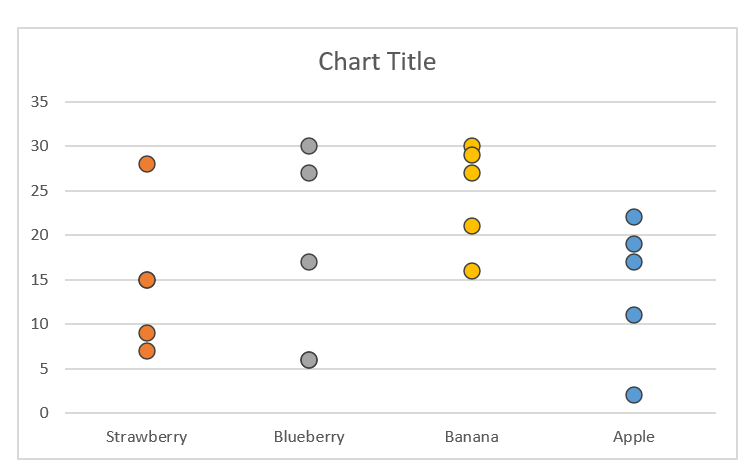
A dot plot (also known as a strip plot or a dot chart) is a graphical representation of data plotted using dots in the x- and y-axes. It is commonly used in statistics to show data trends, frequencies, and groupings.
By default, a dot plot is not readily available in Excel. However, we can use the existing Excel charts to create one. In this article, I’ll show you how to do just that.
Note that dot plots are only ideal on smaller datasets. Large datasets will require more dots, making it more difficult to manage them.
How to Create a Dot Plot in Excel?
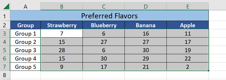
For this illustration, I’m going to use a dummy dataset showing the number of people (per group) that would choose a particular flavor over the other.
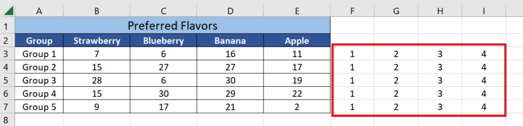
1. The first step we need to do is to count the number of columns inside the dataset that contains the numbers that we want to plot in our charts.
In my example above, I have only four columns for this (columns B to E).
Next to the dataset, add the numbers 1 to 4 (or up to the maximum number of columns you want to plot in your chart). See the example below.
2. Next, we’re going to add a Clustered Column Chart.
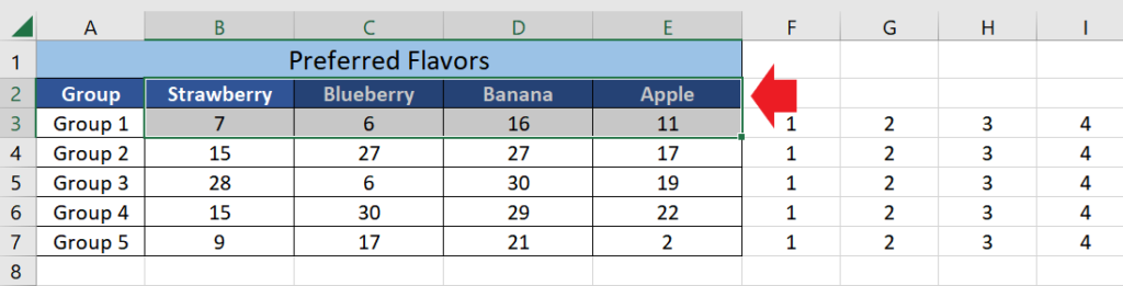
Select the headers of the columns you intend to plot along with their first data row.
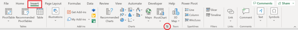
Go to the Insert Tab and select the small arrow button inside the Charts section (see screenshot below).
Doing so will open the Insert Chart menu. Go to the All Charts tab.
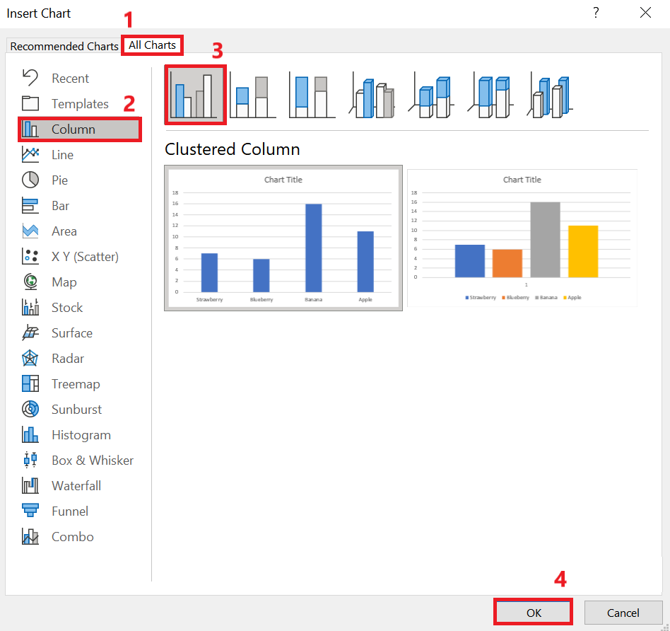
From the list of charts, click “Column” and select the “Clustered Column”chart(the first one in the list).
Once selected, click OK.
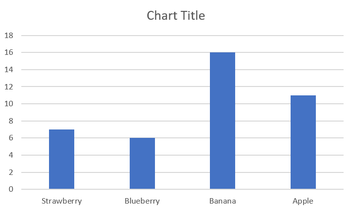
The clustered column chart should now be added to your sheet.
3. Next, we’re going to add a blank series to our chart.
Right-click on this chart and click Select Data.
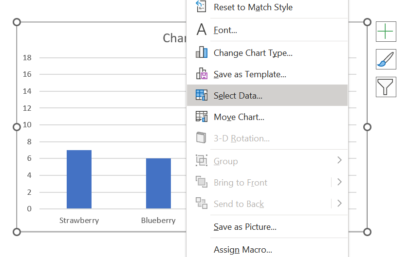
The Select Data Source menu will appear.
Click the Edit button under the Legend Entries (Series) section.
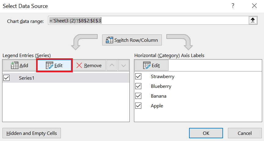
Change the Series values to 0,0,0,0.
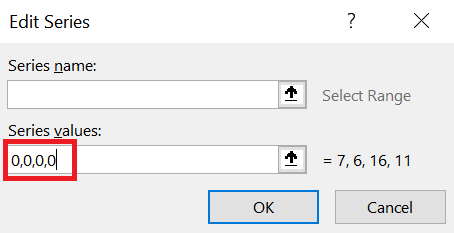
Make sure that there’s one zero for each column you intend to plot.
So, if you have three columns, you should type 0,0,0.
After typing the correct Series Values, click OK and close the Select Data Source menu.
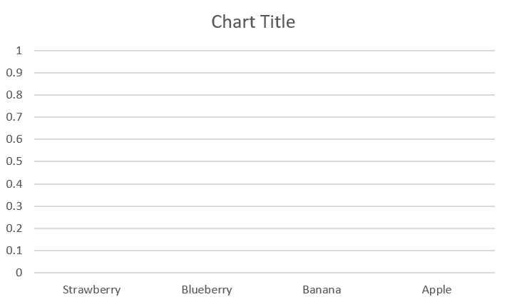
You should now see your chart emptied (as shown in the image below).
4. Next, we are going to add new series (one for each column).
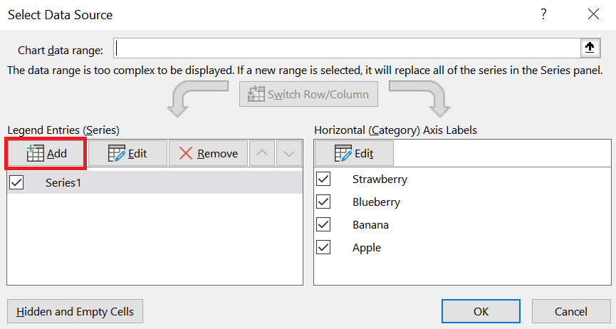
Right-click again on the chart and click on Select Data.
Click the Add button under the Legend Entries (Series) section.
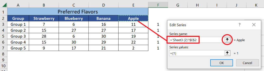
From the Edit Series menu, click the arrow button next to the Series Name.
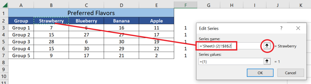
Select the cell containing the header of the first column you want to plot and click OK.
We are going to leave the Series values as is for now.
Repeat these same steps until you’ve added a new series for each column.
Once done, your Select Data Source menu should look something like this:
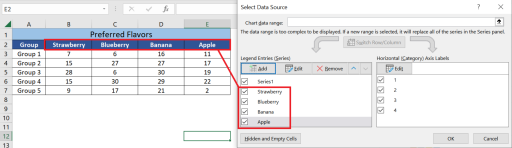
Click OK to close the menu.
5. Next, we are going to change the Chart Type to “Combo”.
Right-click on the chart and select Change Chart Type.
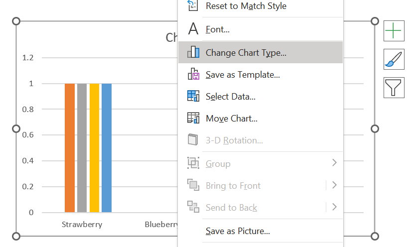
From the list of charts, select Combo.
You will then see the series that you have added to the chart.
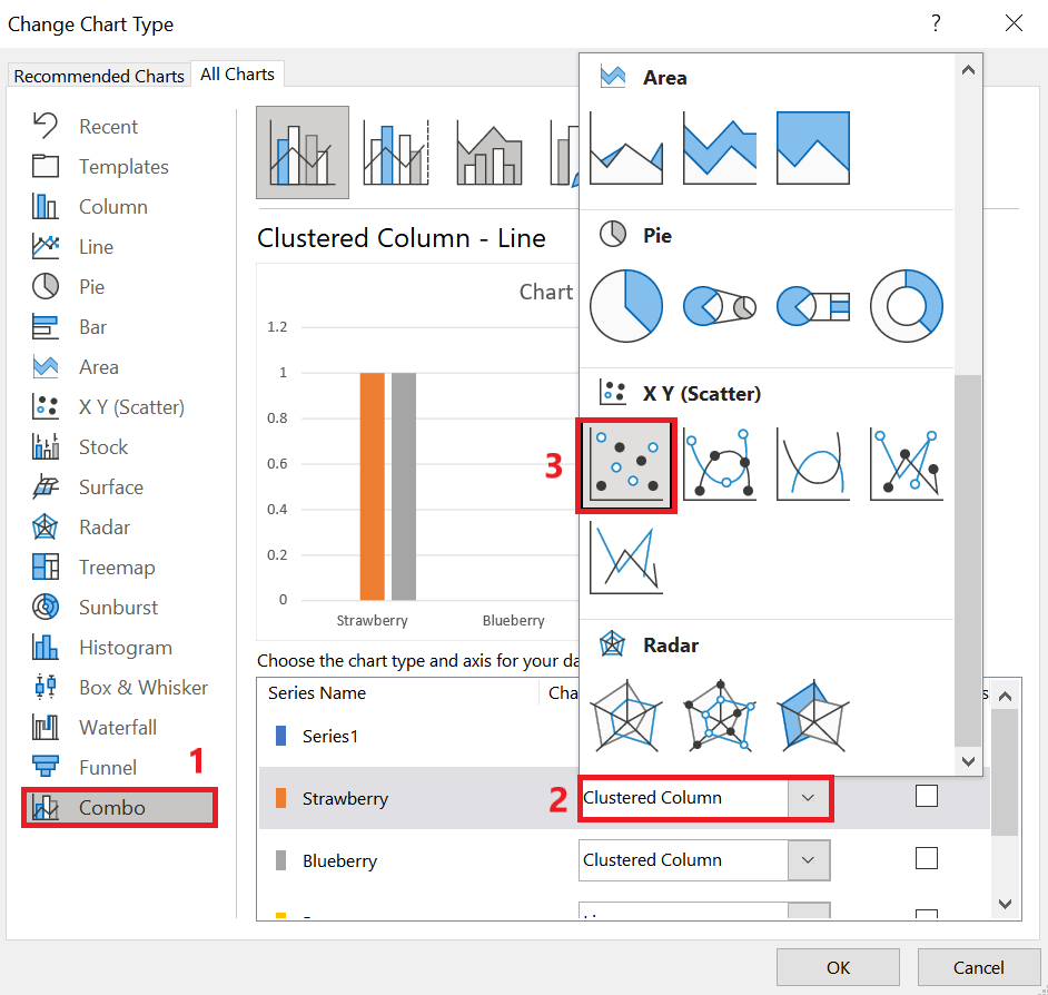
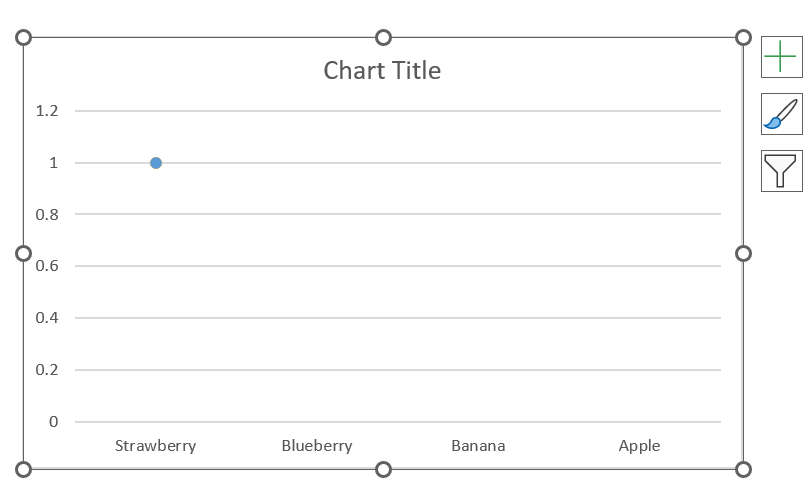
Change the Chart Type of all the series to Scatter (except for “Series1”).
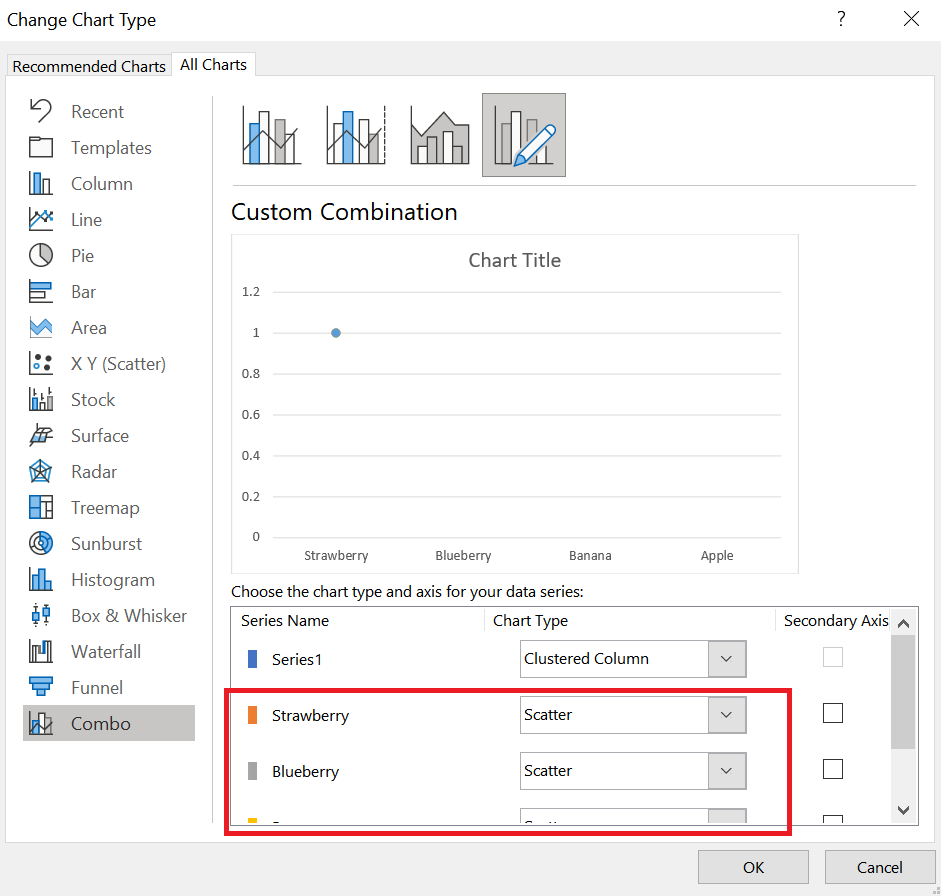
Once done, click OK.
Your chart should now only have one dot inside the chart (see the example below).
6. As the final step, we are now going to update all the Series Values so that they point to the right numbers.
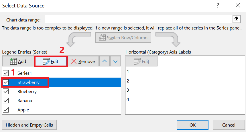
Right-click on the chart and click Select Data.
Select the second series (after “Series1”) and click the Edit button.
Change the Series X Values so that they point to the numbers that we have previously added (1 to 4).
Since we’re first working on the first column, select all the 1’s.
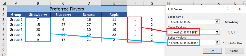
Next, change the Series Y Values so that it points to the corresponding numbers to be plotted.
Once done, click OK.
Repeat the same steps until you’ve updated the X and Y Values of all your series.
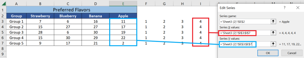
Once done, close the Select Data Series menu.
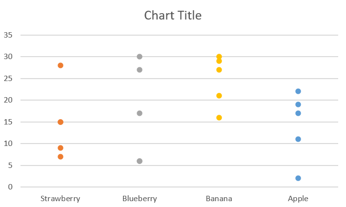
And that’s it! You should now have a dot plot in your sheet.
Change the Size of the Dots
If you want to enhance your dot plot, you can resize the dots so that they look bigger or smaller, whichever you prefer.
Right-click on one of the dots of the data series you want to resize and select Format Data Series.
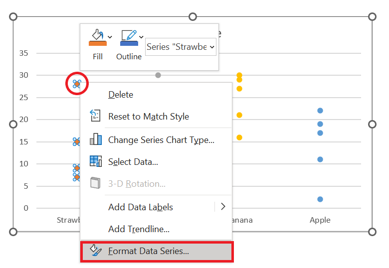
The Format Data Series menu will appear on the right side of the screen.
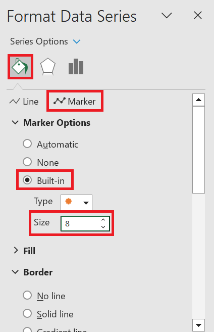
- Click the paint bucket button on top.
- Select “Marker”.
- Click Marker Options.
- Select Built-in.
- Change the size to whatever you like. You can use the up and down arrow to change it.
Repeat these steps with the other data series in your plot.
If you like, you can also add borders to your dots so that they stand out.
Simply go to the Format Data Series >> (paint bucket button) >> Marker >> Border.
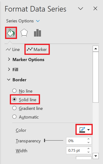
You can select the Solid Line and change the color with whatever you like.
And that’s it! You’ll have your dot plot fully customized to your liking.
Conclusion
As you can see, even though dot plots are not available in Excel, we can still create one using the combination of a Clustered Column Chart and a Scatter chart.
Here is the summary of the steps of creating a dot plot in Excel:
- At the right side of the dataset, add the numbers 1 up to 3 (or up to the total number of columns you want to plot).
- Select the header row along with the first data row.
- Insert a clustered column chart.
- Edit “Series1” so that its values are 0,0,0. Remember that each column should have a corresponding zero.
- Add new series to the chart. There should be one series for each column. Edit the Series Name so that they all point to the corresponding header. Leave the Series Values as is for now.
- Change the chart type to Combo. Change the chart type of all the series (except for “Series1”) to Scatter.
- Edit all the series (except for “Series1”) so that they point to the right numbers. Series X should be pointing to the numbers we have added in Step 1. Series Y should be pointing to the numbers to be plotted in the chart.
- And that’s it! You’re all set.
Other Charts and Plots in Excel:
Tornado Chart in Excel
Contour Plot in Excel
Stem and Leaf Plot in Excel