Error Bars make a very important component of Excel Charts. It is a graphical representation of how far the real values may deviate from the measured values. Due to its range of deviation, it is an essential tool in statistical analysis and scientific experiments.
Microsoft Excel provides you with the versatility of inserting Error Bars in all kinds of charts, such as 2-D bars, columns, line and area graphs, XY (scatter) plots, and bubble charts. Not only that, but you can also display the Error Bars both vertically and horizontally for a better understanding of possible deviation.
Types Of Error Bars in Excel
In Excel, you can add Error Bars to suitable charts like column charts, bar charts, line charts, scatter charts, and bubble graphs. There are mainly four kinds of Error Bars that you can add to your charts. These Error Bars include the following.
1. Standard Error Bars
This is the default error bar type in Excel that helps depict the error in the mean of all values.
2. Percentage Error Bars
You can add the error bars as a percentage of the measured values. By default, the value of percentage error is 5% of the measured values. However, you can change the value of the percentage error as per your data requirements.
3. Standard Deviation
You can display the error bars using the standard deviation. By default, the value of standard deviation is set to 1 for plotting the error bars on your charts. However, you can plot the deviation values manually for a better analysis.
4. Custom Error Bars
Excel offers great flexibility when it comes to error bars. You can define your range of positive and negative values for the error bars. In addition, your customized ranges can also contain any formula for mean or standard deviations.
Moreover, you can change the error bars’ graphical display by choosing between Cap or No Cap, only positive error bars, only negative error bars, or even both. Similarly, you can format the error bars according to the theme of your charts and worksheet.
How to Add Error Bars To Your Chart?
Suppose you have a chart representing the monthly sales of a company.
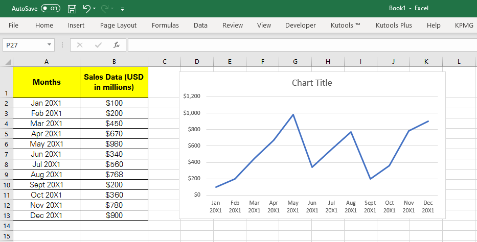
Adding error bars to any chart is quite simple. Follow these steps for adding one to this chart.
Step 1
Click anywhere in the chart. It will open an options panel at the top right side of the chart.
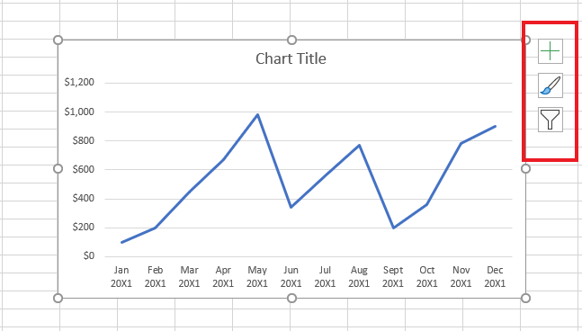
Step 2
Select the chart element button denoted by a plus sign at top of the options panel. It will open the ‘Chart Elements’ list that you can add to your chart.
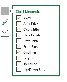
Step 3
Check the Error Bars box to add error bars to your chart.
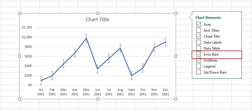
Step 4
Clicking the arrow next to the ‘Error Bars’ option will open the list from where you can select various types of error bars for your chart.
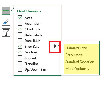
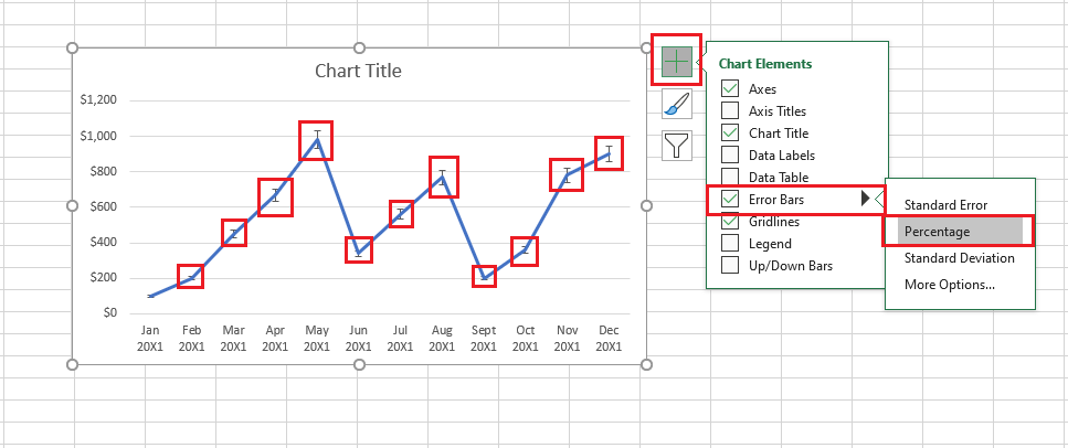
Step 5
By default, the Standard error bars are selected when you add the error bars to your chart. Clicking the Percentage option will add error bars to your chart with the default percentage of 5%. Error bars to your chart would be added as highlighted below in red.
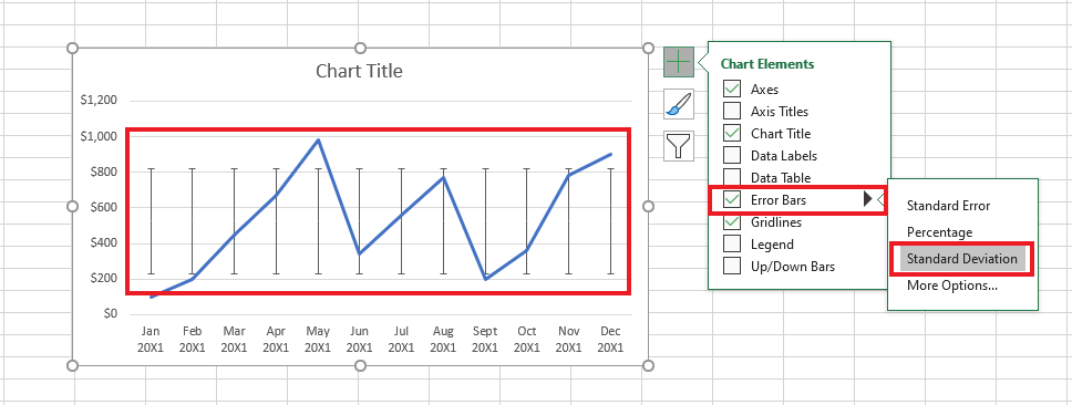
Step 6
Click the Standard Deviation option to add error bars to your chart that represent standard deviation. By default, the standard deviation is set to “1”. However, you can change the deviation value as per your need. The standard deviation type of error bars looks as follows.
Adding Error Bars by Changing the Pre-Defined Values
Microsoft Excel is flexible enough to allow you to customize the error bars as per your requirements. Follow these steps to customize your error bars.
Step 1
Click the Chart Element Plus sign. Select the arrowhead against the error bars option. From the drop-down list that then appears, click “More options”.
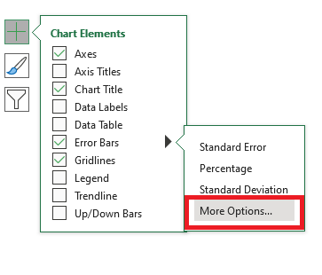
Doing so should open up the ‘Format Error bar’ window that looks as follows.
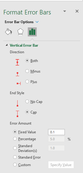
In the Format error bars pane, you get the options to change the directions of the error bars, End style, and the Error Amount.
- Direction
With the Direction option, you can control the display of error bars. You can select to display only the Plus error value or Minus error value. Also, you can select to display both Minus and Plus values simultaneously.
- End Style
This option lets you display the error bars either with a cap at both the ends of the bar or without a cap.
- Error Amount
This option lets you customize the error bar values. By default, the Fixed value is set to 0.1, the percentage is set to 5% and the Standard Deviation is set to 1. However, you can set these values differently depending on your need.
Customizing Error Bars with Similar Error Values
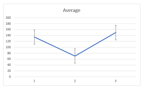
By default, the error bars are set for a value of 1, but you can customize the error bars’ value as per your requirement. Consider the following chart that has the error bars plotted with the standard value of 1 at all data points.
To change the error bars’ positive and negative values at all data points, follow these steps.
- Click anywhere in the chart.
- Select the chart element button denoted by a “+ “sign at the top right of the chart.
- Click the arrowhead next to the Error bars.
- Select the More Options from the list.
- Select the chart option denoted by the Charts icon.
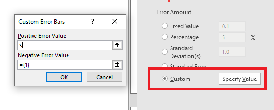
- Check the Custom button.
- Click the ‘Specify’ Value option next to the Custom button.
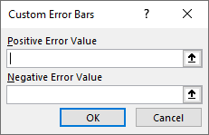
This opens up the ‘Custom Error Bars Value’ window.
Put in positive and negative error bar values as needed to customize the error bar as per your data requirements.
You might have noticed that in the above example, all the data points have the same variance amount. What if all the data points have different variance values? Let us see how you can manage such a situation.
Creating Custom Error Bars when All Data Points have Dissimilar Variance
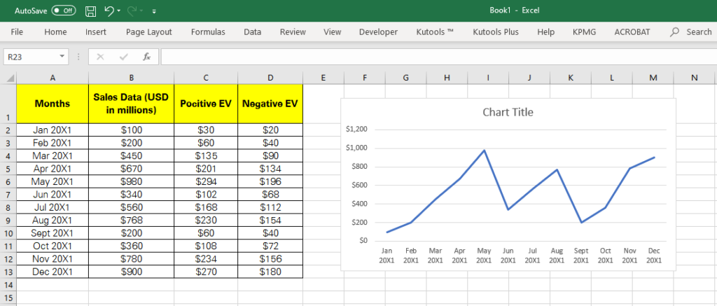
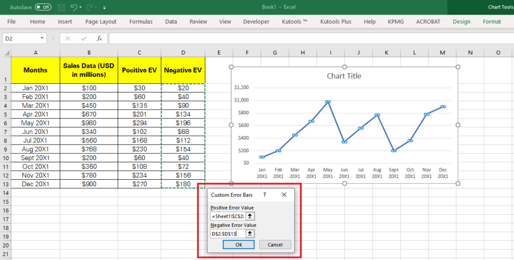
The dataset in the image below represents the monthly sales of a company and the positive and negative error values to plot the chart and add the custom error bars accordingly.
Next, follow these steps to plot error bars with the desired error values.
1. Click anywhere in the chart.
2. Select the Chart Element button that is adjacent to the chart denoted with a “+” sign.
3. From the Chart element window, check the Error bars option.
4. Click the arrow in front of the Error bars option.
5. From the drop-down menu, select the option “More options”.
6. The Format Error Bars pane will open on the right side of your spreadsheet. From the Format Error Bars pane, select the ‘Format error bars’ option denoted by the chart symbol.
7. Under the ‘Error Amount’ option, check the Custom button.
8. Click the “Specify value” button situated next to the Custom option. It will open a new window asking for the Positive and Negative Error bars values.
9. Put the Positive EV range in the Positive Error values and the Negative EV range in the Negative Error Value input box as shown below.
Customizing The Error Bars Using Standard Deviation Values
As you know, the standard deviation is set to 1 by default. However, you can change its value to plot error bars. To know how, follow the example below.

In this chart, the error bars are set with the default standard deviation value which is 1. To change this value, follow the steps below
- Click anywhere in the chart.
- Select the chart element button denoted by a “+ “sign at the top right of the chart.
- Click the arrowhead next to the Error bars.
- Select More Options from the list.
- Select the chart option denoted by the Charts icon.
- Check the Standard Deviation button.
- Put the values in the box that suits your data requirements.
Customizing The Error Bars Using Dissimilar Standard Deviation Values
Excel facilitates you to customize the error bars with different standard deviation values depending upon your data. Check out the example below.
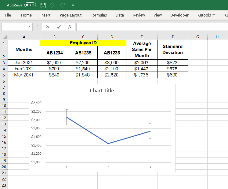
The above image carries some employees’ IDs and the sales data for three different months. The averages of these three months are calculated using the AVERAGE function and are displayed adjacent to the monthly sales data. Whereas the Standard Deviations for these three months are calculated using the STDEV.P function and are placed next to the monthly sales averages.
The above chart reflects the sales for three months and their respective averages. Now we will use these dissimilar standard deviation values to customize the Error bars.
Follow these steps to input these dissimilar standard deviation values to plot the error bars.
- Click anywhere in the chart.
- Select the chart element button denoted by a “+ “sign at the top right of the chart.
- Click the arrowhead next to the Error bars.
- Select More Options from the list.
- Select the chart option denoted by the Charts icon.
- Check the Custom button.
- Click the Specify Value option next to the Custom button.
This opens up the Error bars value input window looking like this.
Within the window above, specify the positive and negative error values for your dataset to generate error bars accordingly.
How to Format Error Bars in Excel?
In addition to all the error bars’ customization options explored above, you can also change the appearance of error bars in Excel. To do so, follow the steps below.
Step 1
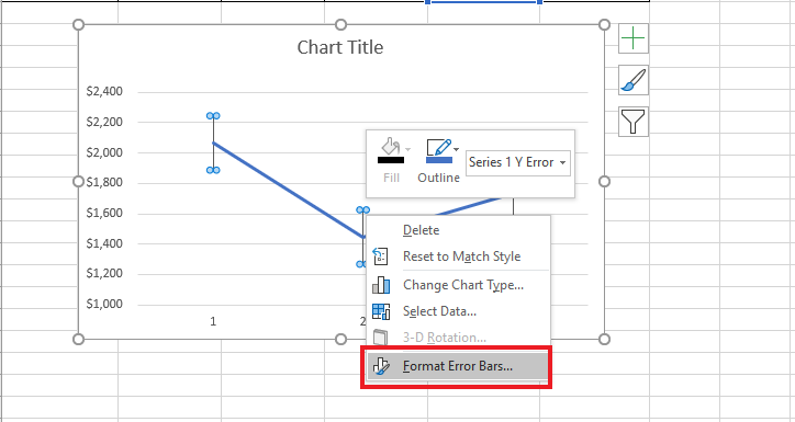
Double Click on the Error bars in the chart you want to edit.
Step 2
To change the appearance of the error bar like color and width, choose the Format Error Bars option.
Step 3
Select Fill & Line option from the Format Error bars pane that then opens.
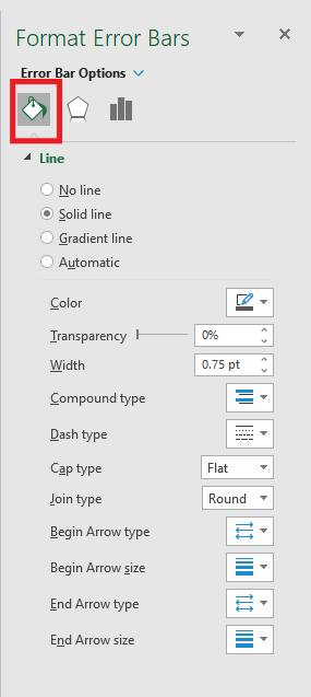
The Fill & Line option provides you with everything to shape the error bars as per your choice. From line to color, width, transparency, and many more options are now at your disposal to format your error bars to your choice.
How to Remove Error Bars From Chart?
Removing error bars from your charts in Excel is only a matter of two clicks. Simply uncheck the error bars option from the chart element list that appears when you press the chart element icon “+”.
Conclusion
The above article elaborates on nearly everything about error bars in Excel.
Starting from types of Error Bars to plotting error bars, customizing error bars as per your requirement, and formatting error bars, everything is now at your fingertips.
Practice using the examples above to master the science behind error bars in Excel.